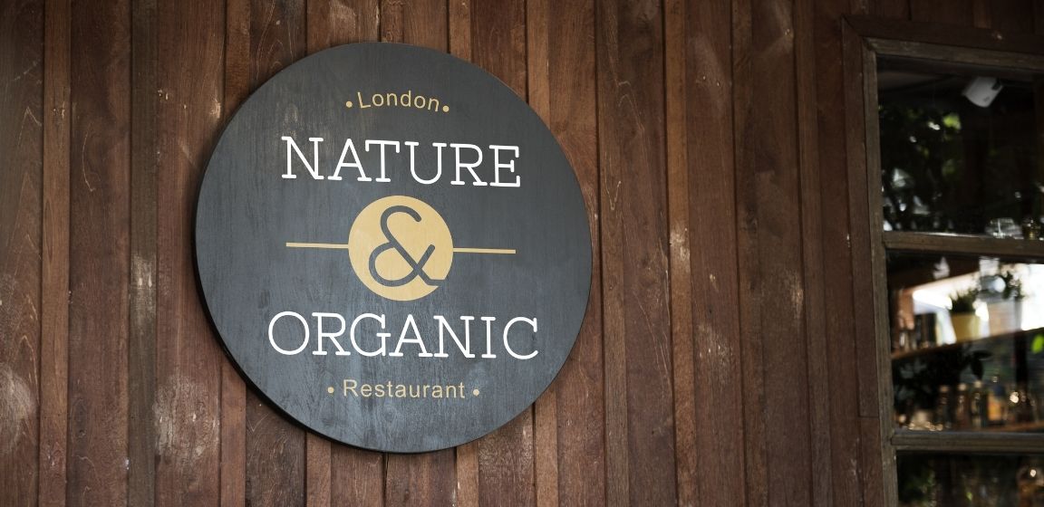
When you’re driving down the street, how do you tell what a business is? Through their sign, of course. Is it visible? Does it look like it hasn’t been updated in 10 years? Whether you’re a new restaurant owner or you’re looking to spice up your sign to bring more customers in, it’s essential to know how to make your restaurant’s sign stand out.
Ladle of Contents
Establish Your Brand Style
Do you already have a brand in place? If so, now may be your opportunity to change it up. What do you want to accomplish with your sign? Are you looking to target a specific customer base? Your brand can make your restaurant more memorable.
If your restaurant is known for its delicious burgers, consider using a burger for your logo. Don’t overthink it—use your popular food items to your advantage. Simplicity is best when it comes to branding.
Figure Out Color Pairing
Choose your colors wisely. Bright colors can make your sign stand out, but only if they work with your branding. If you have a more upscale business, try soft colors such as blush pink and rose gold. Also, keep in mind that you want your sign to be visible day and night. What colors would look best at all hours?
Easy-To-Read Font
You want your font to be clear and easy to read. Cursive only works in specific instances and is usually read best up close; it wouldn’t be great for a sign. The best and most cost-effective way to achieve clear lettering is to use a laser cutting and engraving service.
When choosing your font, consider what you want your customers to assume about your restaurant. For example, specific fonts can give off certain vibes, such as whether or not a place is laidback, upscale, or quirky.
Outdoor Signs Are Your Best Friends
Imagine you’re walking down the street trying to decide where to eat. Would you go to a restaurant with no signs, no menus, little branding, and no pull? Or would you eat at a place with established branding and an outdoor sign listing specials and menu items? Most people would eat at the latter. People want to know what to expect when they walk into a business.
Chalkboard signs may be the most versatile of outdoor signs because you can quickly write your daily specials. A great note to keep in mind is to use humor when applicable. Consider your customer base and what kind of humor would draw them in.
Keep It Clean
A dirty sign may indicate that the restaurant is messy too, and that’s the last thing you want your customers to assume about your restaurant. Make sure to routinely clean your sign to attract more customers!
Your main goal of upgrading your restaurant sign is to tell old and new customers, “Come on in!” Every aspect of your sign can make or break your business. By determining what you want your customers to take away from your restaurant, it’ll be easier to know how to make your restaurant’s sign stand out.

